This document is for offering detailed information regarding the chart you can use for your dashboard in Analytics Framework, including how to configure them and how to choose the right type of chart for your need, with visual examples.
Before explaining each chart type, let’s start with the common points in all chart types.
Options for Advanced Charts
You can set Title, Subtitle, X Axis Name, and Y Axis Name for every chart type.
If the chart type has a legend to be shown in the bottom, you can choose whether to show legend or not. If a legend shows up in the bottom of the chart, you can hide/unhide a specific part of the chart by clicking each value in the legend.
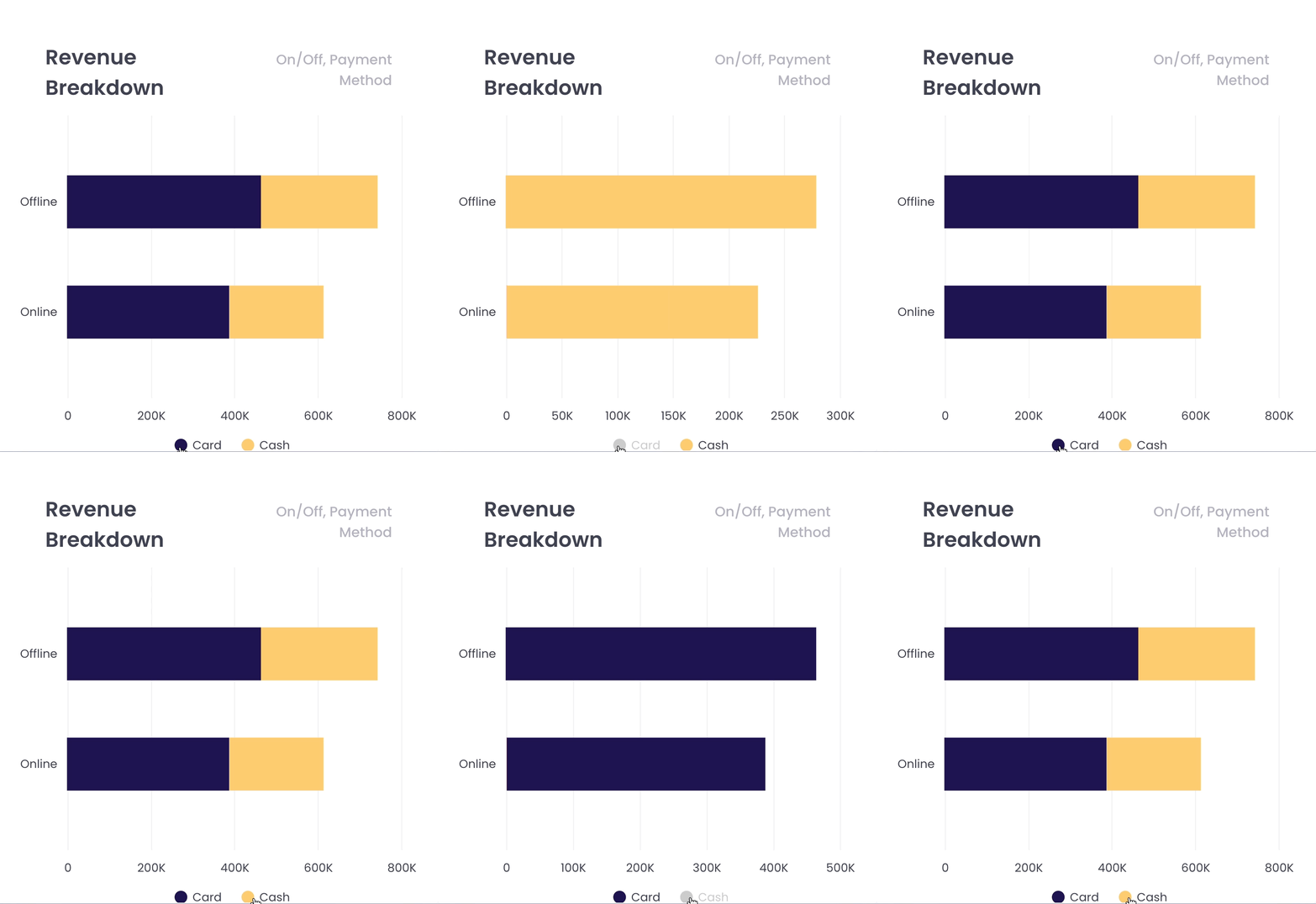
Chart Types
Multi-Series / Stacked Column Chart
The column charts show the data with vertical boxes.
| Possible Cases | Measure By | Analyze By |
| The number of columns | 1 | 1 or 2 |
| 2+ | 1 |
If you want to set multiple columns for ‘Measure By’ and ‘Analyze By’, you are able to decide if you want a multi-series or stacked-column chart for showing multiple values in the chart.
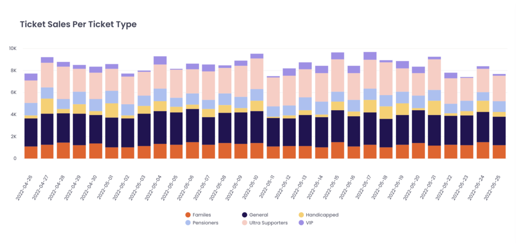
This is the scenario with one Measure by and two Analyze by. The first Analyze by goes to X-axis and the second Analyze by is expressed with different colours. You can also check the second Analyze by in the legend on the bottom side.
Multi-Series / Stacked Bar Chart
The bar chart shows the data with horizontal boxes.
| Possible Cases | Measure By | Analyze By |
| The number of columns | 1 | 1 or 2 |
| 2+ | 1 |
If you want to set multiple columns for ‘Measure By’ and ‘Analyze By’, you are able to decide if you want a multi-series or stacked-column chart for showing multiple values in the chart.
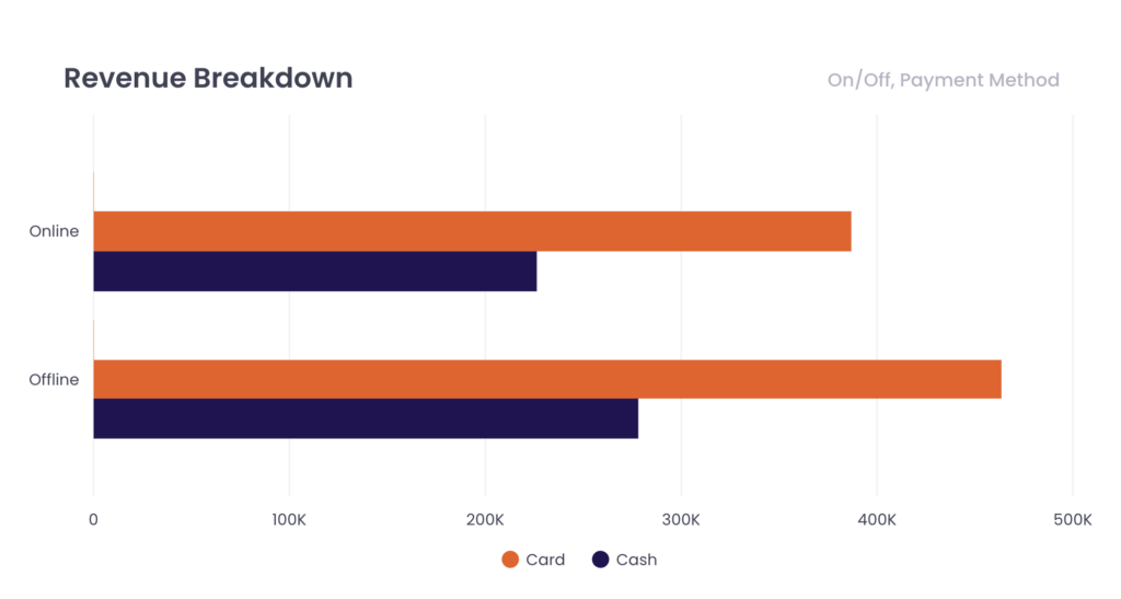
This is the scenario with one Measure by and two Analyze by. The first Analyze by goes to the Y axis and the second Analyze by is expressed with boxes of different colours. You can also check the second Analyze by in the legend on the bottom side.
Multi-Series Spline Chart
The spline chart shows the data with curves and circle-shaped indicators.
| Possible Cases | Measure By | Analyze By |
| The number of columns | 1 | 1 or 2 |
| 2+ | 1 |
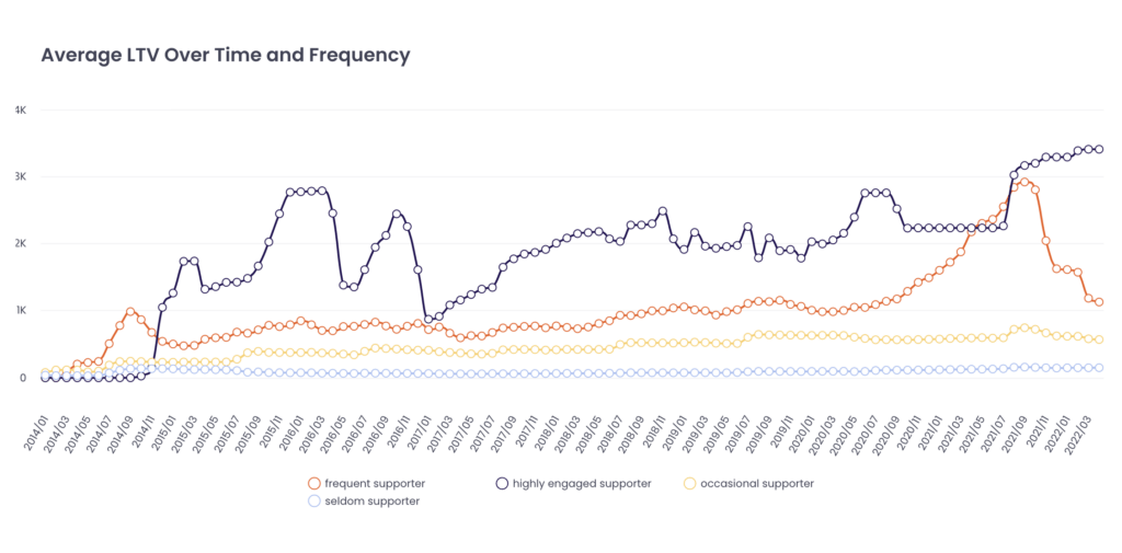
This is the scenario with one Measure by and two Analyze by. The first Analyze by goes to X-axis and the second Analyze by is expressed with lines of different colours. You can also check the second Analyze by in the legend on the bottom side.
Multi-Series Spline Area Chart
The spline area chart shows the data with the areas between the curves and X-axis.
| Possible Cases | Measure By | Analyze By |
| The number of columns | 1 | 1 or 2 |
| 2+ | 1 |
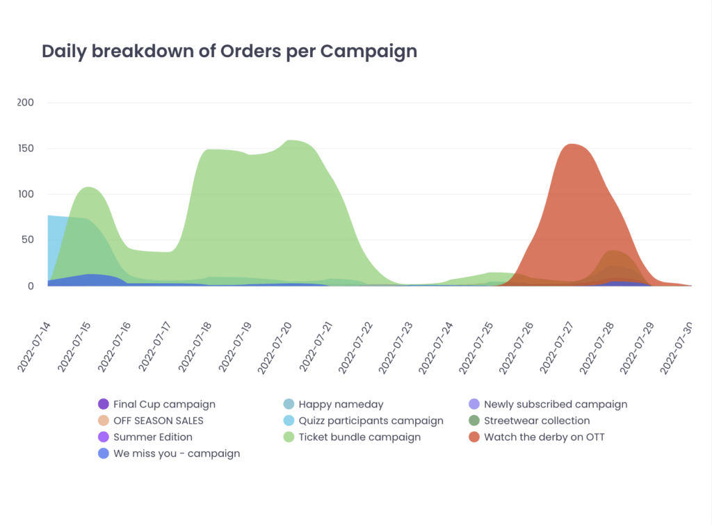
This is the scenario with one Measure by and two Analyze by. The first Analyze by goes to X-axis and the second Analyze by is expressed with areas of different colours. You can also check the second Analyze by in the legend on the bottom side.
Pie Chart and Donut Chart
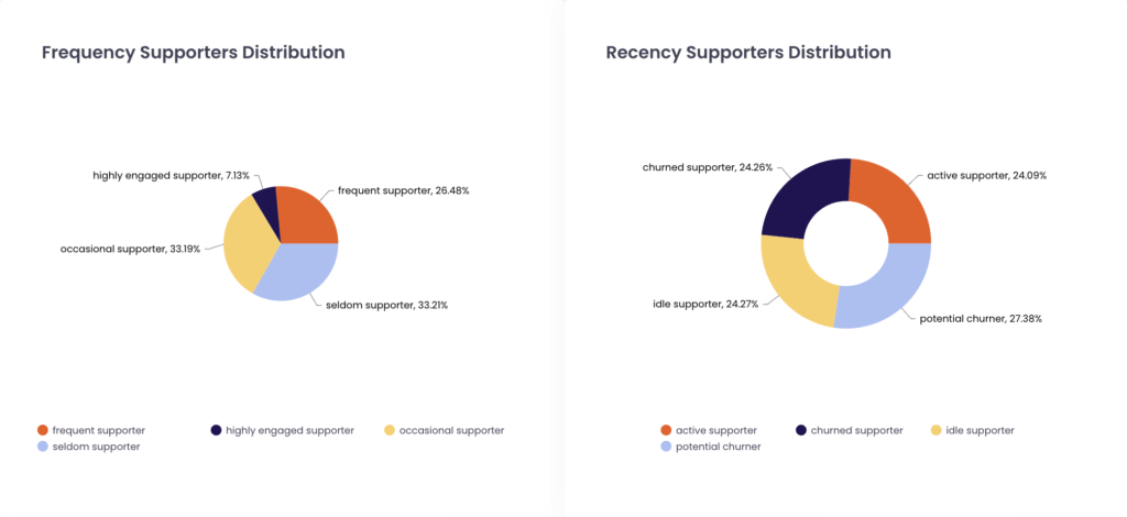
The pie chart shows the data with a circle divided into slices to illustrate numerical proportion. The donut chart is a pie chart with its center cut out to look like a donut.
| Possible Cases | Measure By | Analyze By |
| The number of columns | 1 | 1 |
Combo Chart
The combo chart shows the data with a combination of a column chart and a spline chart.
| Possible Cases | Measure By | Analyze By |
| The number of columns | 2 | 1 |
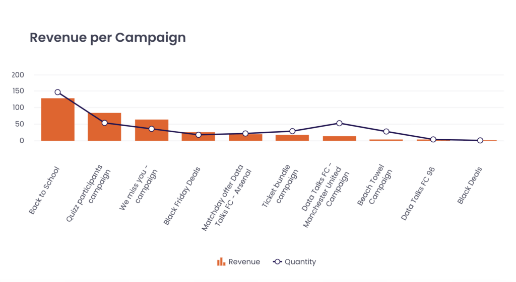
This is the scenario with two Measure by and one Analyze by. The first Measure by is expressed by columns and the second Measure by is expressed by splines.
Bubble Chart
The bubble chart shows the data with various sizes of circles (bubbles). The size and location of the circles represent each of the dataset.
| Possible Cases | Measure By | Analyze By |
| The number of columns | 3 | 1 |
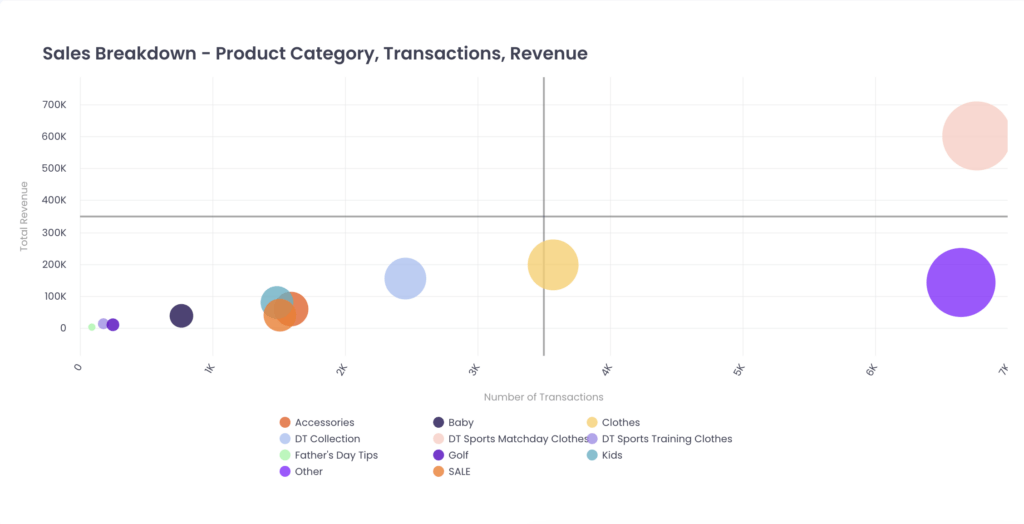
This is the scenario with three Measure by and one Analyze by. The first Measure by is expressed in the X axis, the second Measure by is expressed in the Y axis, and the third Measure by is expressed in bubbles of various sizes.
Heatmap Chart
The heatmap chart shows the data with a grid of colored squares, for a main variable of interest across two axis variables.
| Possible Cases | Measure By | Analyze By |
| The number of columns | 1 | 2 |
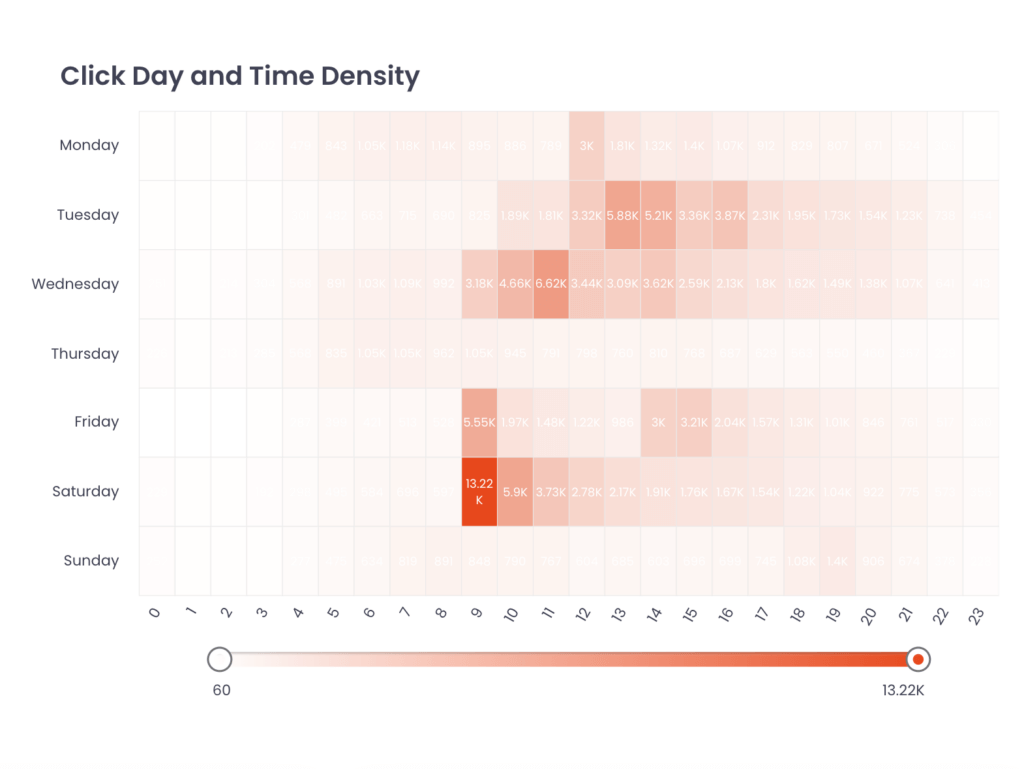
The scroller on the bottom side of this chart type shows the value range from the minimum to the maximum. You can set the value range which will be shown in the heatmap chart by adjusting the location of the scrollers.
Time Series Charts
The time series chart shows the data with a line graph according to the time flow.
| Possible Cases | Measure By | Analyze By (DATE) |
| The number of columns | 1 | 1 |
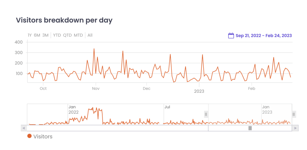
You can set the time period with these options:
1. Select time periods on the left upper side of the chart
2. Zoom in and out in the upper chart area
3. Adjust the length of the period in the lower chart area
4. Set the time period with the date selector in the right upper corner
Box with Whisker Chart
The Box with whisker chart shows the distribution of data into quartiles, highlighting the mean and outliers, with boxplots. It can show 6 summary number of values in the analysed range:
- Minimum: the lowest value
- Q1 (First Quartile): the median of values which are lower than The median
- Median: the one middle value or the mean of the two middle numbers
- Q3 (Third Quartile): the median of values which are higher than The median
- Maximum: the highest value
- Mean: the average of the values
Both ends of the whisker show the minimum and maximum.
Both ends of the box show the Q1 and Q3 value.
The line dividing the color of the box shows the median.
The black snowflake shows the mean.
Box with Whisker Chart is a very special type of chart in that it has ‘Across By’, in addition to ‘Measure By’ and ‘Analyze By’. This chart shows how many values from ‘Measure By’ exist in each value from ‘Analyze By’ per each value from ‘Across By’. In this case, Measure By and Analyze By decide the location and size of the Box and the Whisker. Across By decides the number of the Box and the Whisker.
Example Case:
If you would like to know how many tickets are sold per match and want to see the result per ticket category, you should choose ticket purchase id as ‘Measure By’ with countdistinct formula, match name as ‘Analyze By’ and ticket category as ‘Across By’.
| Possible Cases | Measure By | Analyze By | Across By |
| The number of columns | 1 | 0 | 0 |
| 1 | 0 | 1 | |
| 1 | 0 | 2 | |
| 1 | 1 | 1 | |
| 1 | 1 | 2 |
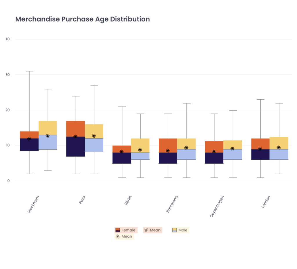
This is the scenario with one Measure by, one Analyze by, and two Across by. The first Across by is expressed in the X axis and the second Across by is expressed by two boxes for one X-axis value. You can also check the second Across by in the legend on the bottom side.
Sankey Chart
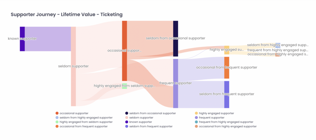
The Sankey Chart shows the data with a type of flow diagram. The width of the arrows is proportional to the flow rate of the depicted extensive property.
Sankey Chart is beneficial because it allows you to see the data in both a very specific and detailed view and generate interactive views. Due to the complexity existing inside the chart itself, configuring a Sankey Chart with your data needs extra work from the side of the CDP, rather than on your side. If you are intrigued about using this chart type for your dashboard then your CSM is always happy to help you.
Still feel ambiguous about which chart type you should choose?
Please refer to the use cases below.
Useful Cases
Column charts, Bar charts and Spline Charts are the most common and frequently used chart types. They are very straightforward with well-marked vertical or horizontal boxes and easy to use for the example cases:
- Analyse how many supporters consent to the marketing email
- Analyse how many tickets are sold per match
- Analyse how much merchandise is sold per product category
Pie chart and donut chart are the best chart type to show the portions out of the entire amount.
- Analyse how many supporters are in per age group
- Analyse how many tickets are season ticket or normal ticket
- Analyse how much merchandise is sold online or offline
Heatmap chart is useful when you would like to show the most preferred attributes across two standards.
- Analyse which age group has purchased both season tickets and jerseys the most
- Analyse which jersey is the most popular one for season ticket holders
- Analyse which time and day of the week is the best to send a new email campaign
Time Series chart is the best option for your need to see the data according to the time flow.
- Analyse how the supporter base has increased over time
- Analyse how the ticket sales have increased over time
- Analyse how the merch sales have changed over time
Box with Whisker Chart will help you to see the variations and distributions of the dataset.
- Analyse how have ticket sales improved over seasons grouped by matches
- Analyse how the average attendance has increased across different seasons
- Analyse the revenue variation from merchandise across product categories
- Analyse the variation between online and offline revenue across games
- Analyse merchandise revenue variation based on season ticket holder length in years
- Analyse the variation of total supporter spending for male and female supporters
- Analyse the variation of stadium attendance against certain opponents
- Analyse the variation of in-stadium sales and revenue across opponents/seasons
- Analyse the variation of OTT behavior in terms of number of videos watched and length of videos watched