The Analytics Framework gives you the opportunity to set up your own analytics without the need to involve Data Scientists or Analysts from your team, thanks to our scorecards with chart analysis. Use our analytics to flexibly create real-time dashboards to visualize and analyze your customers, segments, and overall marketing efforts according to the KPIs you’ve defined. Tracking the right KPIs will allow you to better understand how your customers and prospects interact with your business, and ultimately deliver a better customer experience.
How it works #
This guide will show you in a step-by-step guide how you can set up your analytics dashboard in our Analytics Framework and get going with measuring the results of your marketing strategy to make sure you get ROI.
Data Talks CDP is offering two options for you to have analytics dashboards.
The first one is to use our pre-configured dashboards with your relevant data sources, which are called Out-of-the-box Dashboards of the CDP. The Out-of-the-box dashboards are covering the most common and important analytics for sports organisations, such as ticketing sales status and merchandising. With the Out-of-the-box dashboard, every relevant analysis is ready for you to be checked and monitored right after importing your data to the CDP.
More information about how to use them and which Out-of-the-box Dashboards are available is in this guide.
The second one is to configure your own dashboard from the scratch, which will be explained in detail below. We are providing a wide range of functionality to display, calculate and visualise data. With this option, you can achieve your own analysis perfectly tailored to your needs with a deeper level of understanding of your data and digital maturity at some point.
Analytics Framework Overview #
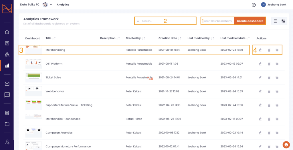
By clicking the Analytics Framework icon on the left-hand side menu you will be directed to the Analytics Framework Overview.
What you are able to do in the Overview:
- Create a new dashboard: insert a name and click the ‘Create dashboard’
- Search for existing dashboards: insert the name of the dashboard you want to find
- Check the generic information of dashboards
- The preview image of each dashboard
- The title of each dashboard
- Who has created and modified the dashboard
- When the dashboard has been created and modified
- Take Actions to manage the dashboards: Edit / Delete / Clone
- Click the row the dashboard belongs to and then you will be redirected to the specific dashboard in order to see the detail and start editing
Create a New Dashboard #
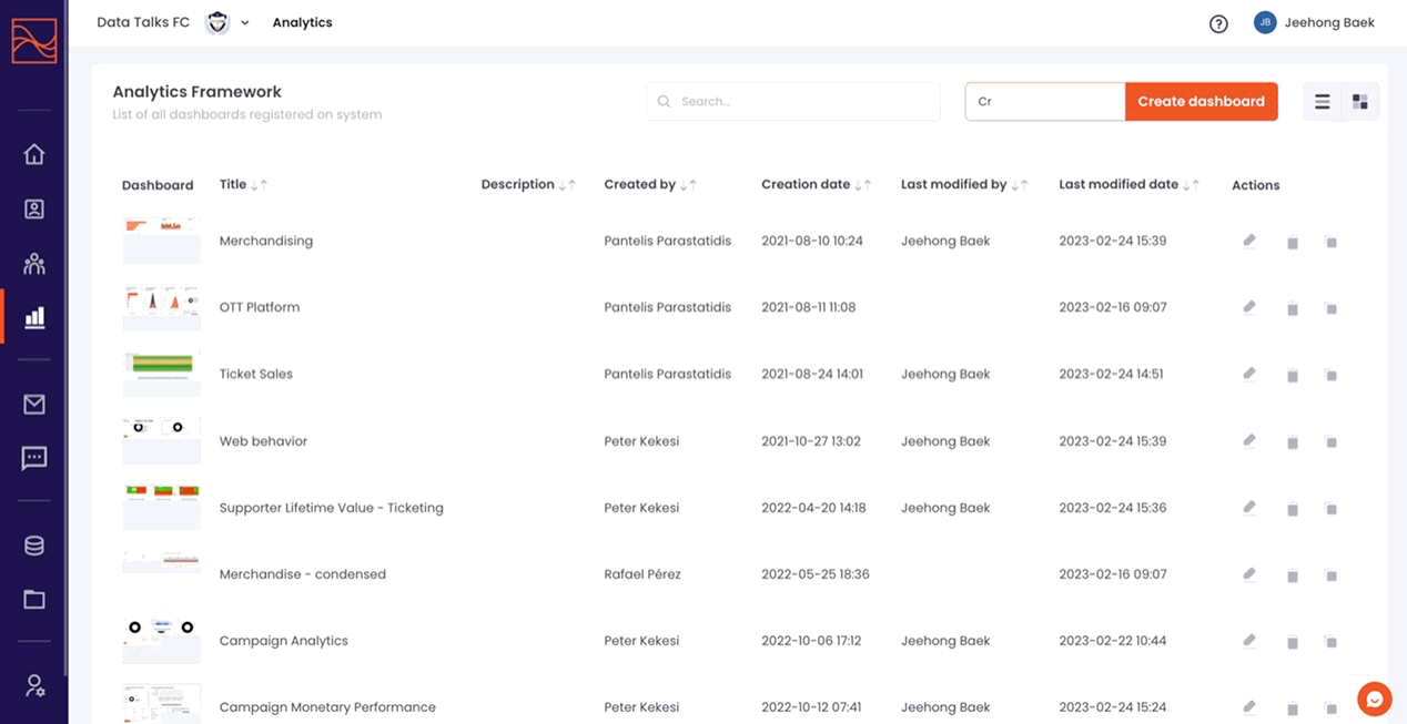
First, let’s create a new dashboard from the scratch. Insert a name in the ‘Insert Dashboard Name’ box and click ‘Create dashboard’. You can set the name of the dashboard such as ‘Ticket Sales Status’, ‘Merchandise Sales Status’, or whatever you want. The number of dashboards you can create is unlimited.
By clicking on the ‘Create dashboard’ button, you will be redirected to the dashboard which is created just before. Click on ‘Configure now’ to start setting up your analytics.
By clicking ‘Configure now’ you are presented with the panel on the right-hand side which is where all of your tools to set up your dashboard are located.
Data Sources #
For configuring datasets for the controls such as tiles and charts, we highly recommend you understand first which data you can use for them. The Data Source tab allows you to check which schema and table exist in your CDP database, the columns to be used, and the relationship between tables, which leads to much more abundant data analysis.
- Schema: It refers to how the database is constructed/divided on a high level. E.g. Profiles, Events, Inventory, Segmentation, Email Builder and Analytics Framework.
- Table: It refers to how the database is constructed/divided on a detailed level. E.g. Supporter Profiles, Ticket Purchase Events, and Email Campaign Analytics.
- Column: It refers to the attributes which belong to tables and are actually used for configuring datasets. E.g. Ticket Price, Customer ID, and Membership registration date.
- Relationship: It refers to the relationships between tables for cross-referring. To create an appropriate relationship, both tables should include the key column of the same format.
You only can use the tables and columns configured in the Data Source tab. Also, you can analyse and visualise the data across the tables only if there is a relationship between the tables.
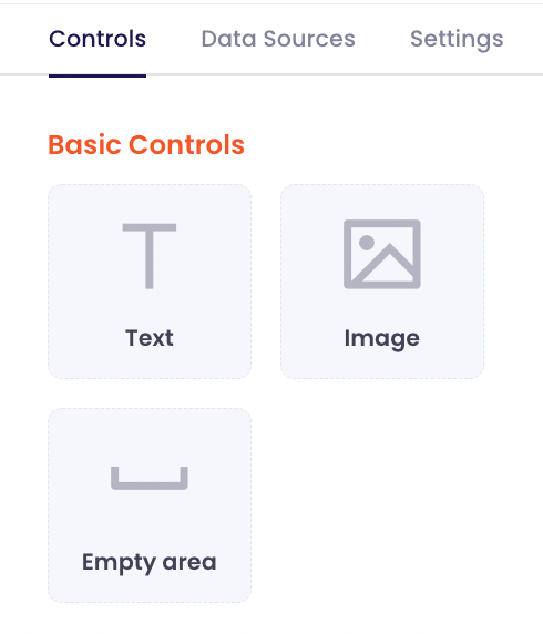
Controls #
In the Controls tab, you can find all the options of control you can use for configuring the dashboard. Simply drag and drop any block you want to add into the dashboard, and then you can start configuring each of them. These are the list of controls you can make use of:
Basic Controls: Without Data Configuration #
- Text: Type anything you want, as many words as you want. Even inserting a link is possible. You can coordinate the style, size, colour, and alignment of the text.
- Image: Upload any image you want or you can select your organisation logo and header if they are saved in the CDP.
- Empty Area: It is useful for improving the aesthetics of the dashboard and placing visual gaps between charts.
Dashlets/Filter: With Data Configuration #
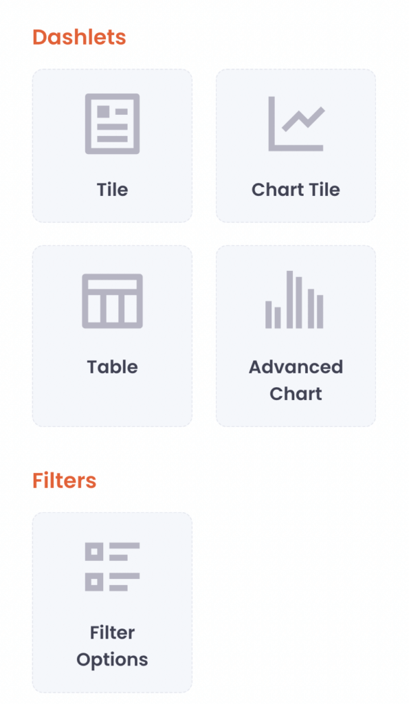
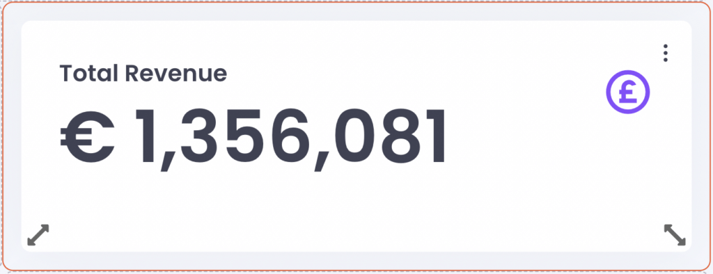
- Tile: If you need to show a simple number based on your data, this block is useful. You are also able to insert an icon to indicate which data the tile represents.
- E.g. the number of tickets sold, total revenue of ticket sales, the number of Facebook Page followers
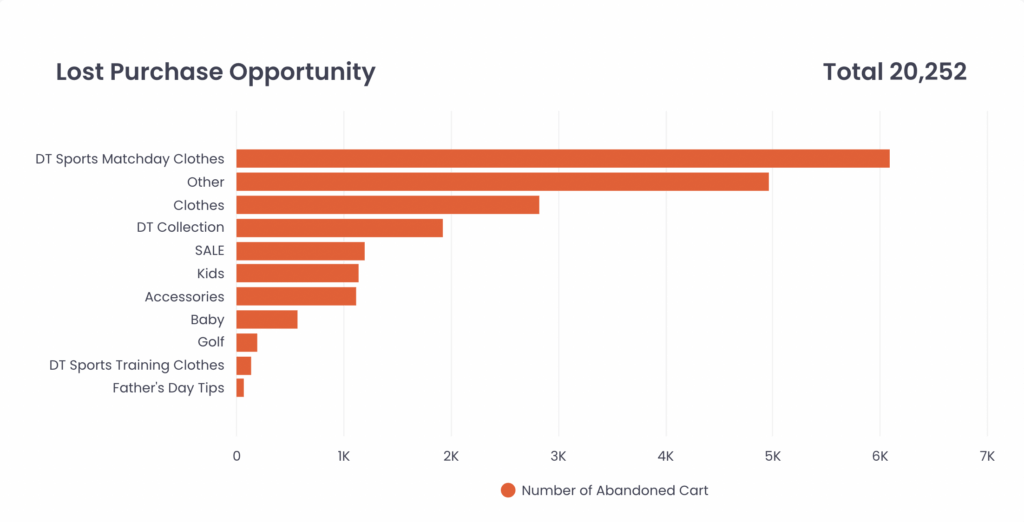
- Advanced Chart: Visualise your data in a variety of chart types.
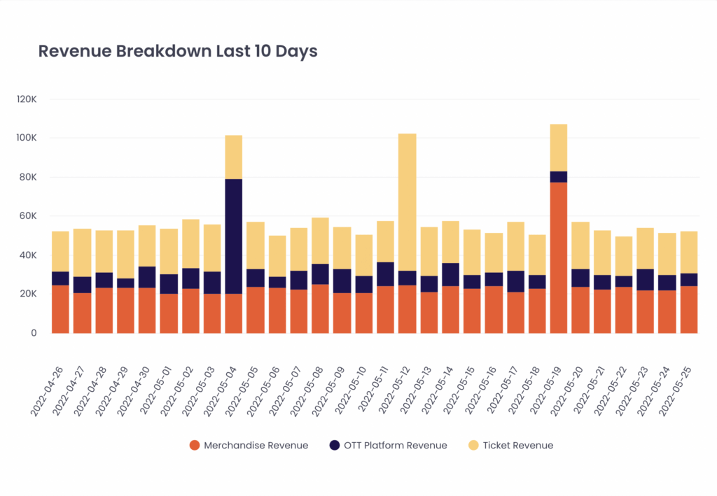
- Chart Tile: The combination of tile and chart. It means that you can show a simple number and a visualised chart based on your data in one block. You can configure the dataset for the tile and for the chart part separately, according to the data configuration rules of the tile and chart. We recommend using the tile part as total aggregation and the chart part as breakdown.
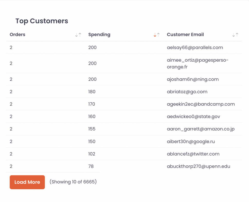
- Table: If you need to show an organised list of your data, a table would be useful. You are able to set values with ‘Measure By’, and the columns with ‘Analyse By’ at the same time to order and filter the values with ‘Order By’ and ‘Filter By’. You can also order the values with the sorting options shown in the first row of the table.
- E.g. Top Match List – with the highest attendance and tickets sold, Top Merchandise Store List – with the highest revenue
- Filter: It allows you to filter all the data shown in the controls in the dashboard.
Configuring Data Set for Controls #
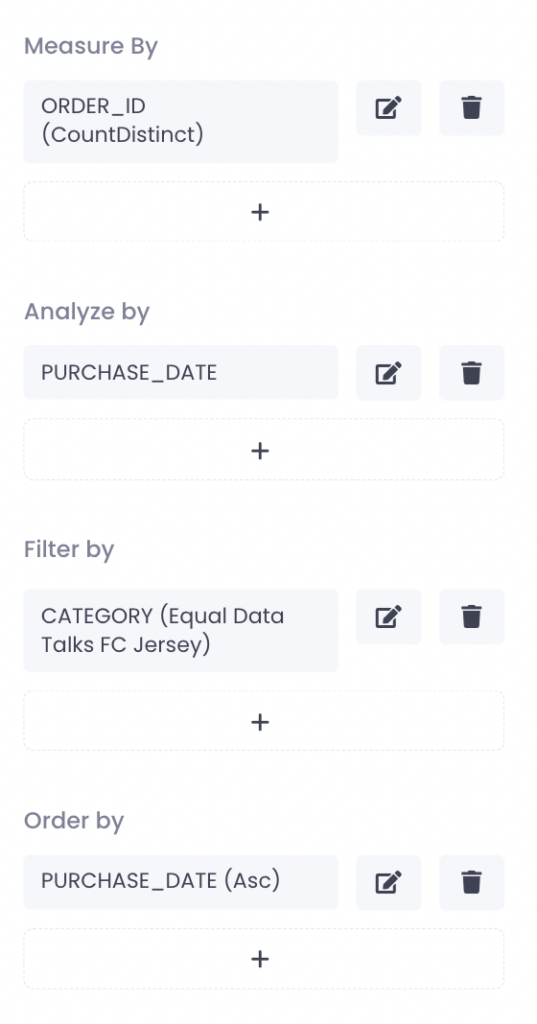
For tile, you need to select only one column for ‘Measure By’.
For all chart types and tables, you need to select at least one column for ‘Measure By‘ and ‘Analyze By‘ sections. The number of the needed column varies depending on the chart type. ‘Filter By‘ and ‘Order By‘ is always optional.
For filter, you need to select only one column for filtering.
- Measure by
- This is the primary column of values you want to measure.
- It means SELECT in SQL rule.
- When choosing which column(s) you want to measure, please note that you can ONLY choose attributes from the same data source or the related data sources which have a relationship, set up under data sources, with the data source ‘Measure By’ column belongs to, for ‘Analyze By’, ‘Filter By’ and ‘Order By’. Choose how the data should be calculated and click Add.
- Calculation formula list:
- Sum: Sum up all values in the column.
- Average: Calculate the Average of all values in the column.
- Count: Calculate the number of all values in the column, allowing duplication.
- Countdistinct: Calculate the number of all values in the column, prohibiting duplication.
- Max: Achieve the maximum number of all values in the column.
- Min: Achieve the minimum number of all values in the column.
- All: Show all values as they are in the column, allowing duplication.
- Distinct: Show all values as they are in the column, prohibiting duplication.
- Median: Achieve the one middle value or the mean of the two middle numbers among all values in the column.
- Q1 (First Quartile): the median of values which are lower than The median among all values in the column.
- Q3 (Third Quartile): the median of values which are higher than The median among all values in the column.
- Analyze by
- This is the column of values to be used for the calculation.
- It means GROUP BY in SQL rule.
- For instance, if you choose Sum as a formula in ‘Measure By’, the values in ‘Measure By’ column are summed up by the values in ‘Analyze By’. If you want to calculate which age group shows the greatest revenue, you should Revenue with Sum as ‘Measure By’ and Age group as ‘Analyse By’.
- NOTE: You can ONLY choose the columns from the same data source or the related data sources to the data source ‘Measure By’ column belongs to.
- Filter by
- This is the column of values to be used for filtering data shown in the chart.
- It means WHERE in SQL rule.
- You can use various filtering rules with the filter input.
- Filtering rule list:
- Equal – Filter rows only when the values of the column are accurately matched with the input
- NotEqual – Filter rows only when the values of the column are not accurately matched with the input
- Greater – Filter rows only when the numerical values of the column values are greater than the input
- GreaterOrEqual – Filter rows only when the numerical values of the column are greater than or equal to the input
- Less – Filter rows only when the numerical values of the column are less than the input
- LessOrEqual – Filter rows only when numerical values of the column are less than or equal to the input
- BeginsWith – Filter rows only when values of the column begin with input
- NotBeginsWith – Filter rows only when values of the column do not begin with input
- EndsWith – Filter rows only when values of the column end with input
- NotEndsWith – Filter rows only when values of the column do not end with input
- In – Filter rows when the column is an array and the input is in it
- NotIn – Filter rows when the column is an array and the input is not in it
- Has – Filter rows only when values of the column contain input (case insensitive)
- Contains – Filter rows only when values of the column contain input
- NotContains – Filter rows only when values of the column do not contain input
- Between – Filter rows only when values of the column are between the input (Input should be period format)
- NotBetween – Filter rows only when values of the column are not between the input (Input should be period format)
- IsNull – Filter rows only when the values of the column are null
- IsNotNull – Filter rows only when the values of the column are not null
- IsEmpty – Filter rows only when the values of the column are empty
- IsNotEmpty – Filter rows only when the values of the column are not empty
- NOTE: You can ONLY choose the columns from the same data source or the related data sources to the data source ‘Measure By’ column belongs to.
- Order by
- This is the column of values to be used for ordering data shown in the chart.
- It means ORDER BY in SQL rule.
- You can choose Ascending or Descending order. For example, if you choose the Ticket Purchase Date column for Order By and select Ascending order, the chart with the configured dataset will show values according to the order from the first ticket purchase date to the latest ticket purchase date.
- NOTE: You can ONLY choose the columns selected for ‘Measure By’ or ‘Analyse By’.
Once you click each control created, you can find that the options in the right sidebar have been changed for setting up each control.
- Options: Set detail and configure data for the control.
- Layout: Set the margin and padding of the control.
- Setting: Set the name of the control, duplicate it within the dashboard or to other dashboards, and choose whether to disable it or not with a toggle. If your dashboard is handling too many controls, disabling some controls which are not needed at this moment would help to increase the loading speed and performance of the dashboard.
Once you finish inserting all controls you need, then please do not forget to click ‘Back to View Mode’. Then you are able to see the dashboard be well-organised and settled so that you do not have to save the dashboard itself again. You can click the go-back button to the overview now!
Setting #
The settings you are able to edit in the Settings tab:
- Change the name of the dashboard
- Add some description to the dashboard
- Pin the dashboard to the sidebar: If you toggle on this setting, the dashboard is pinned to the sidebar and shown under the Analytics Framework menu in the sidebar. This function allows you to go to the dashboard with shortcuts, instead of getting bothered with trying to find the dashboard you want in the list.
Once finishing setting up, please do not forget to click Save.
Edit the dashboard #
Creating a good analytics dashboard is not the easiest task in the world. You might want to delete and edit the control blocks you have already made or, even want to reuse the existing control blocks by duplicating them instead of creating new control blocks from scratch. All of the requirements are possible and easy to do!
- Editing the blocks: Click the block you want to edit and the sidebar will be changed for setting up the block.
- Deleting the blocks: Click three dots on the right upper corner of the block and find Delete
- Duplicating the blocks: Click three dots on the right upper corner of the block and find Duplicate